
Tenge
A project to enhance user engagement and increase conversions by improving the overall user experience, messaging, and visual design.

Project
Role: UX/UI Designer
Tools: Adobe XD, Adobe Photoshop
Duration: 3 Months
Challenge
The previous website had unclear messaging, poor readability, and a generic design, resulting in high bounce rates and low conversions. High-traffic pages and top landing pages needed customization to increase user engagement and time spent on page.
Solution
By revamping the website with a user-centric design, clear calls-to-action, and improved content readability and messaging, we aimed to create a more engaging and effective user experience that would increase conversion rates.
Competitive analyses and quantitative analytics research was performed to understand user behavior. Key pages—such as contact, about us, practice areas, and case results—were highly visited but had high bounce rates. The site had generic headlines and a bland design. Strong ratings and positive client reviews needed to be highlighted to distinguish the firm from competitors.
Wireframes were developed for key landing pages, incorporating visual cues to guide users to valuable content. The header was redesigned to include review snippets, creating a trustworthy first impression. Calls-to-action and contact forms were made more inviting and user-friendly. High-traffic pages were personalized to better reflect the firm’s unique value proposition and enhance the overall user experience.
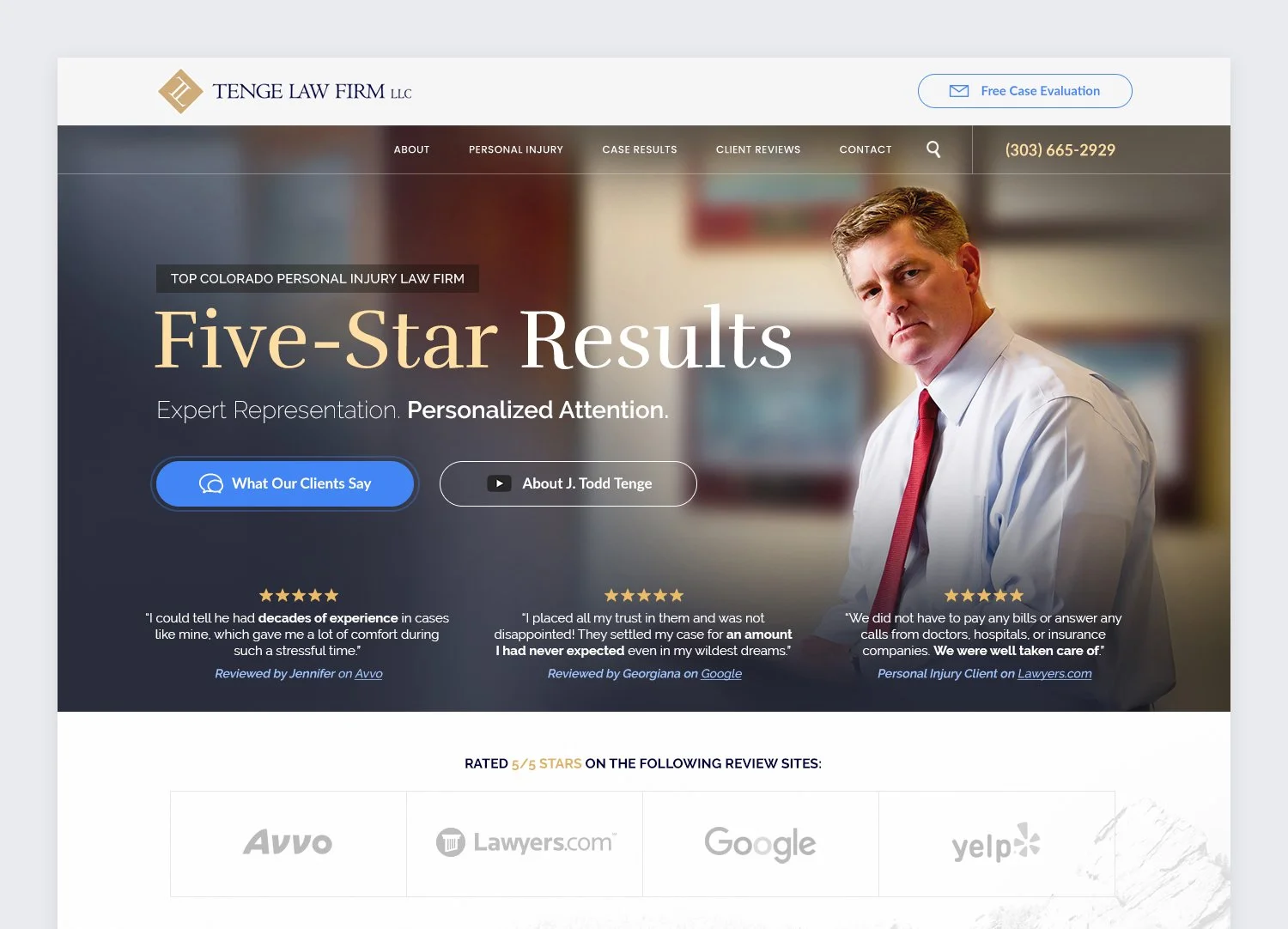
Header featuring 5-star review snippets and primary CTA linking to client testimonials
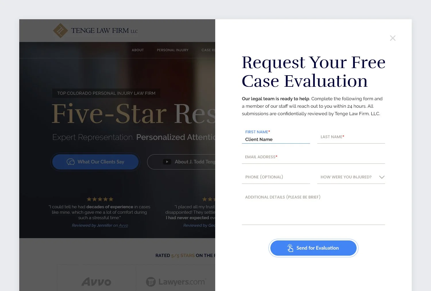
Consultation button reveals an easy-to-use slide-out form for streamlined contact
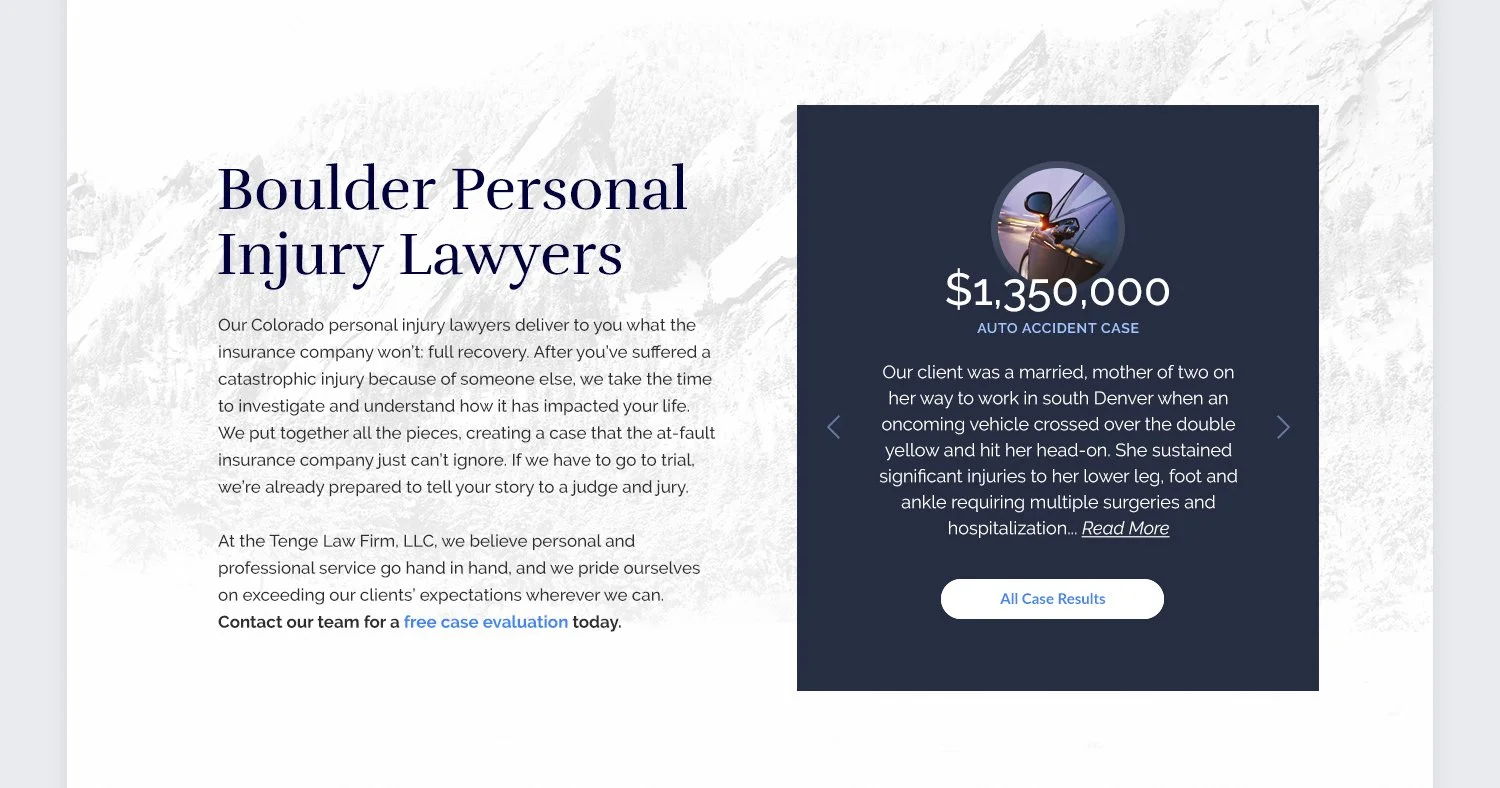
Content paired with card displaying rotating cases for dynamic, up-to-date results

Areas of focus with links to common and high-demand practice areas

Extra-large consultation panel throughout the site features office locations for easy contact
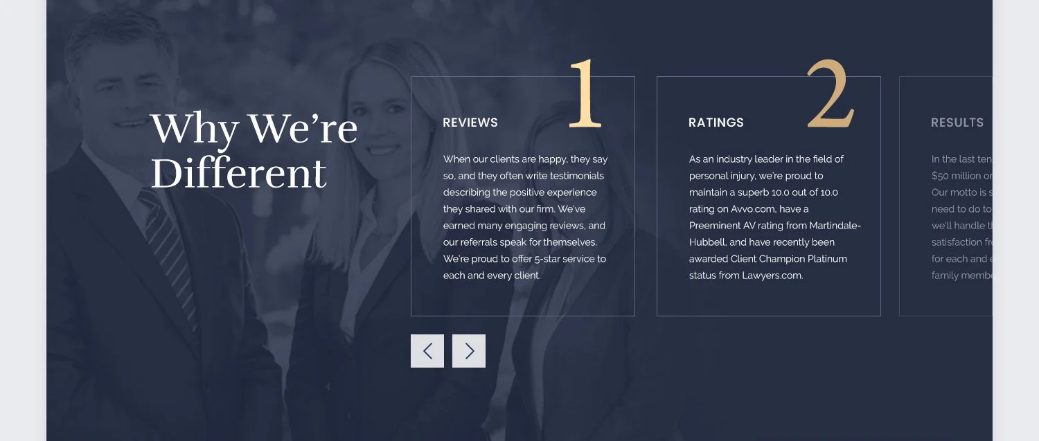
Scrollable panel highlighting the firm’s 3 Rs, setting them apart and supporting their UVP
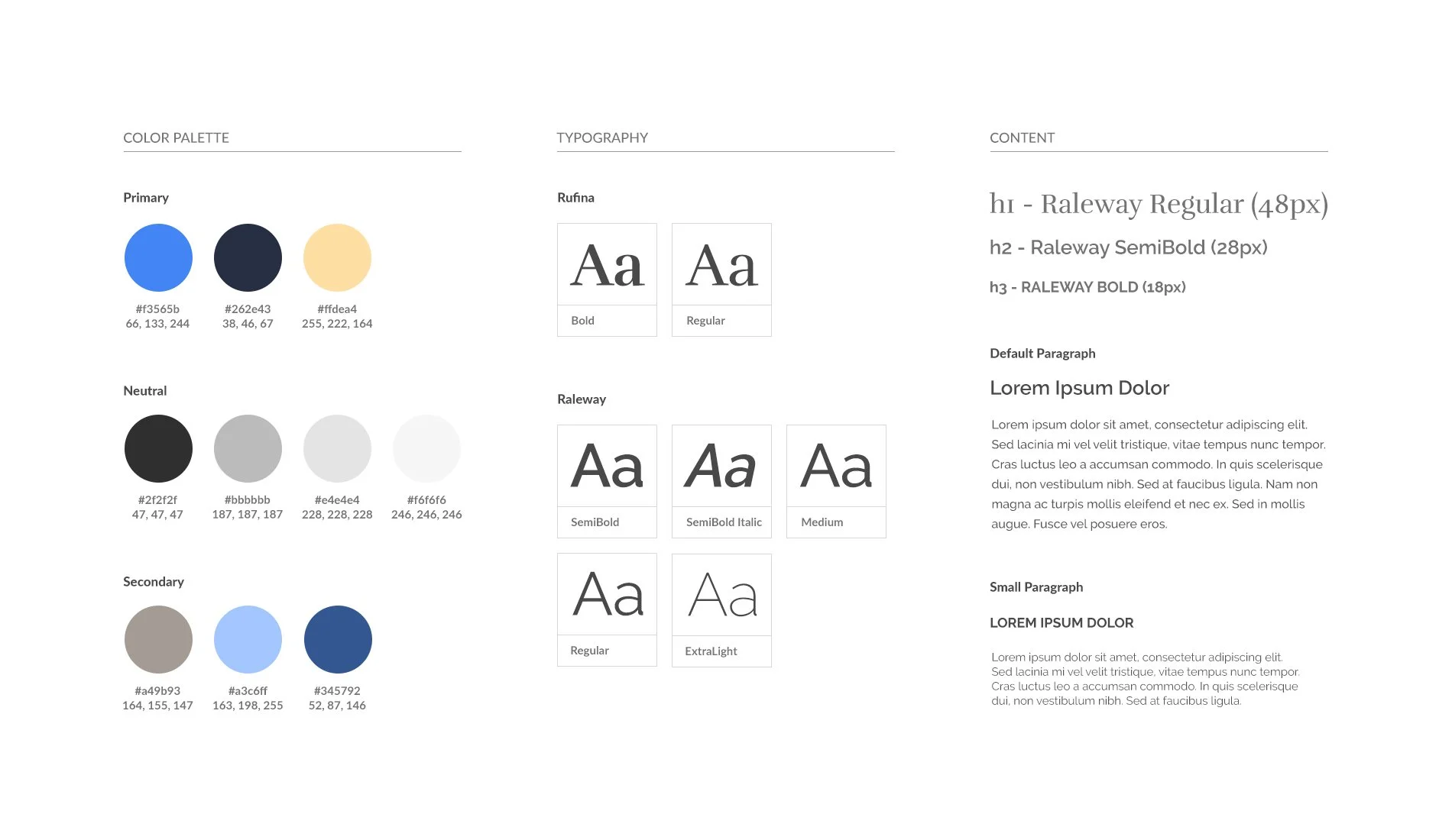
Style guide snippet
First Impressions
Evaluating the old site revealed that the header design failed to make a significant impact. Headers on key pages lacked personalization, and the homepage header overwhelmed users too early, coming across as overly needy during research. To address this, I redesigned the headers to provide value first, fostering trust. The new headers were more visually balanced, helping identify valuable information while employing a gentler approach to reduce cognitive strain.
Before
Homepage header
Inside page header
After
Homepage header
Practice area sub-header
Inside page header
Practice area header