
Internicola
A website redesign project for a national franchise law firm, with the goal of educating visitors and converting them into clients.

Project
Role: UX/UI Designer
Tools: Adobe XD, Adobe Photoshop
Duration: 4 Months
Challenge
Given the complexity of franchising, the law firm wanted their website to be a trusted source of information and establish them as experts in entrepreneurship. Their current site needed to be organized, restructured, and reflect the firm’s friendly, boutique feel.
Solution
If we enhance the website's information architecture and user experience by implementing a well-organized resource center and showcasing client success stories, users will engage more deeply with the content. This should lead to increased user trust and conversions.
A thorough discovery phase was conducted involving client interviews and web analytics to understand user behavior and identify pain points. The site’s information architecture was restructured, revealing three types of visitors: those looking to franchise their business, scale their existing franchise, and those seeking resources.
To showcase the firm’s impactful and inspirational client success stories, we included a primary call-to-action (CTA) button in the homepage header that played a compilation of entrepreneur success stories. A secondary button that opens a user-friendly submission form was added to the pre-header for visitors interested in a consultation.

Header features CTA button for client testimonial videos, followed by three primary cards to guide users

User-friendly lightbox form opens upon clicking consultation button

Team panel showcases friendly staff, highlighting human element of the firm
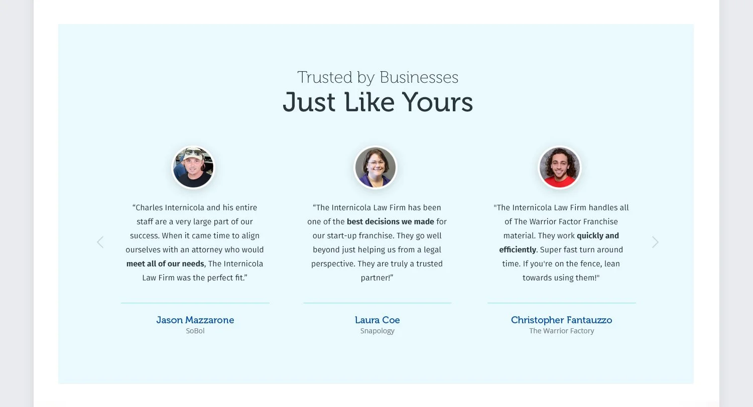
Testimonials panel highlighting experiences shared by real clients to build trust

Call-to-action panel with company logos featuring the firm in publications for added credibility

Style guide snippet
Resource Center
To kick off the new resource center we began by ideating two potential concepts through sketches and wireflows, refining them into prototypes for remote testing. The chosen design featured a filtering system that organized content by category, which was highly praised in usability tests. This resource center included videos, webinars, articles, and downloadable guides. Throughout this phase, we worked closely with developers to ensure the design was feasible and successfully.
Initial sketch
Final design